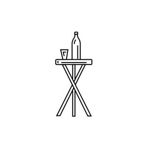
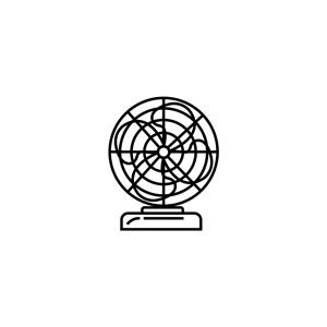
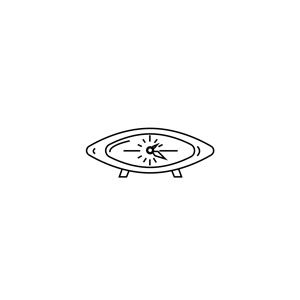
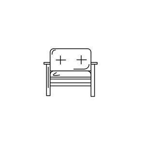
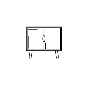
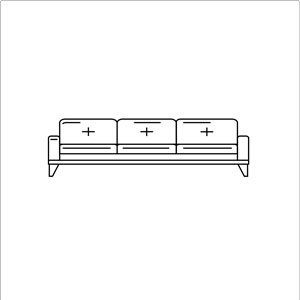
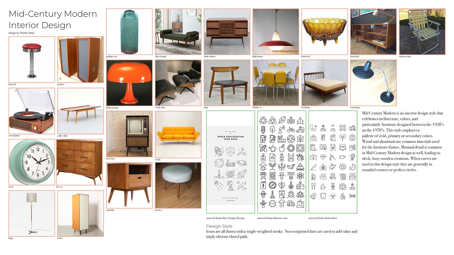
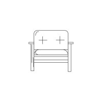
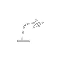
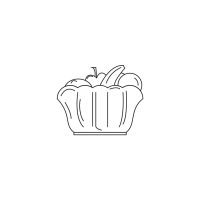
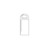
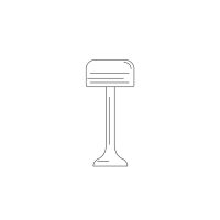
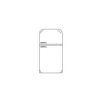
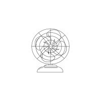
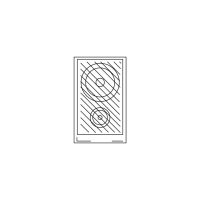
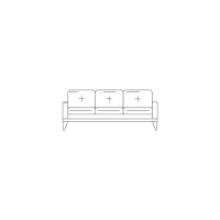
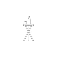
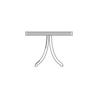
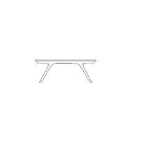
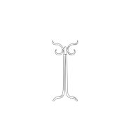
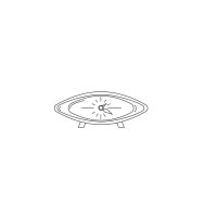
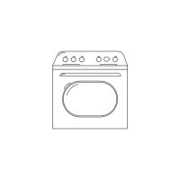
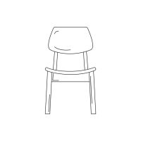
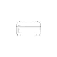
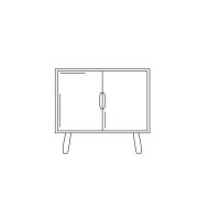
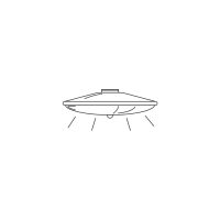
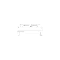
Icons are illustrations that serve a representative function. To better understand how to develop and use icons, a practice in research and illustration was conducted. The process began by selecting a topic on which to conduct research and identify 25 items within that topic that could be represented with an icon. The chosen topic was mid-century modern interior design. This was a design style seen between the 1950s and the 1970s. The style is characterized by simplicity, adherence to traditional forms such as rectangles and circles, and the celebration of the materials used in crafting. After finding 25 items under the category of mid-century modern interior design, the next step was to research icon illustration styles. Icon styles vary in perspective, color, and level of detail. Three styles (with graphic examples) were chosen as references for the style in which the 25 future icons would be illustrated. From the research a collage of information, including visual as well as textual aids, was assembled to aid as an illustration reference. The first iteration of the icon set was found to correctly represent the items for which it was created, however, the illustrations did not correctly follow the referenced styles. The illustrations were overly detailed and did not carry an equally proportionate line-weight, affecting the readability of the icons. A second iteration was published with corrections based on the first critique and effects such as light rays for the lamps and accessories for the furniture were added to the illustrations to demonstrate their function. The practice instilled the importance of balancing functionality and creativity.
Word Search
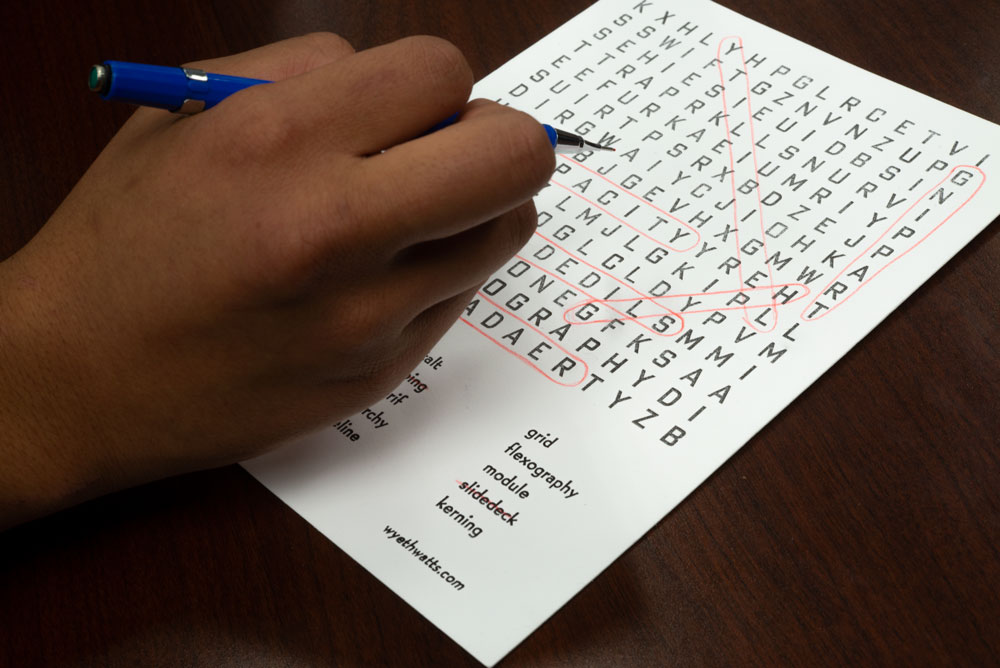
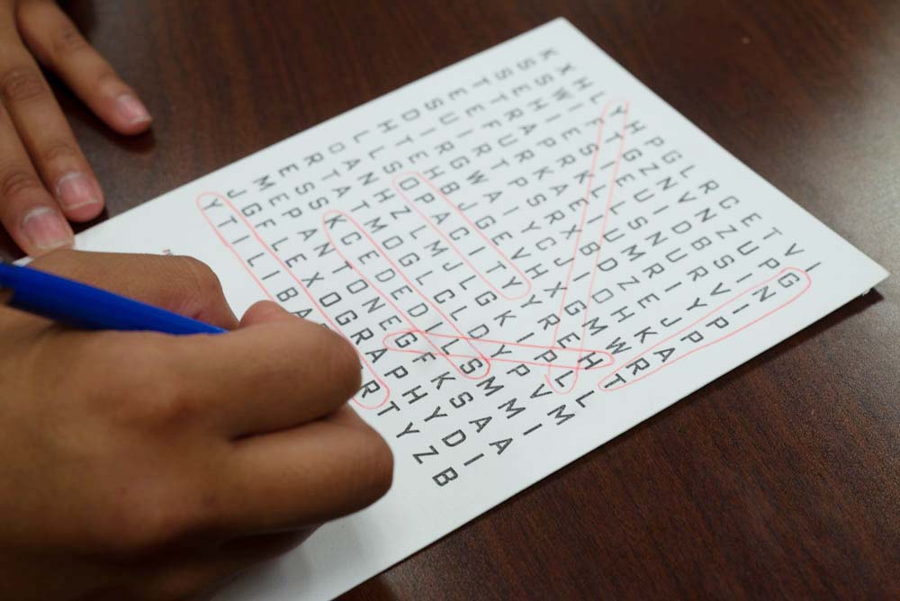
Printed with a Chandler & Preston printing press, the word search project was a practice in leading, the spacing between lines, and kerning, the spacing between characters. After the subject words were elected, a word scramble with the correct parameters was made from an online generator. Beginning from the top row, each row of letters was taken from the 18 point Bank Gothic Condensed drawer of metal type until 225 characters made up a jumbled square. The next step was to arrange the characters into a grid of equally spaced characters; this was done using 18 point spacers of varying widths to equalize the distance between each character and make the columns, rows, and diagonals readible. A key showing the subject words was also set and printed in a smaller typeface on the bottom third of the paper.
pulling type to be set
printing
Personality Quiz
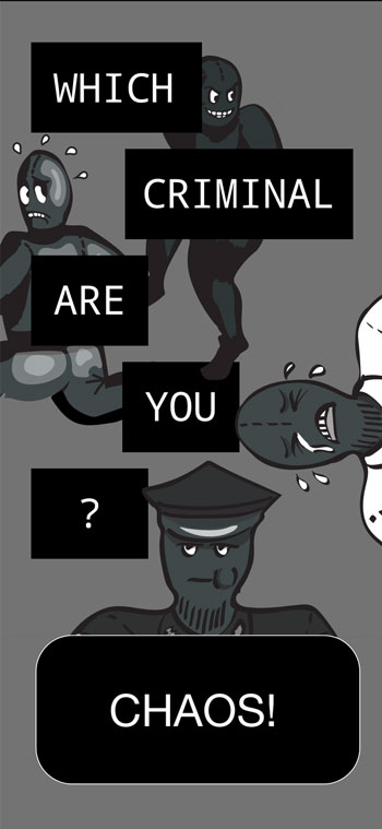
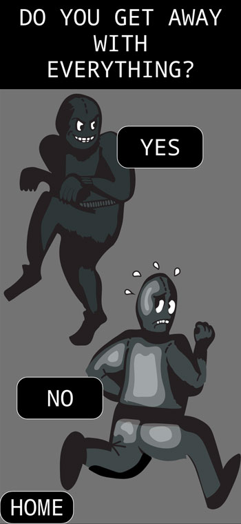
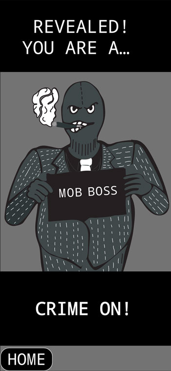
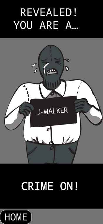
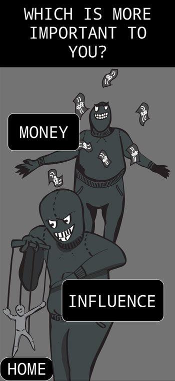
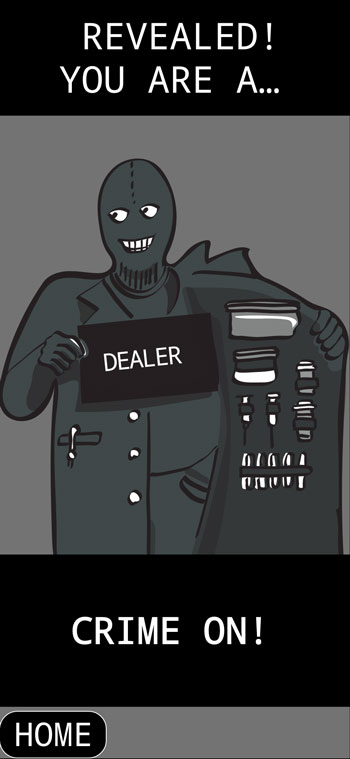
A simple personality quiz was created to study user-experience design. This quiz was developed first in a sketchbook filled with various questions and subsequent outcomes responding to the answers. The concept that the project was based around was what hypothetical criminal would the user identify with based on their responses to three questions. Illustrations in the quiz provided visual aid to the questions and the interface was supposed to be understandable to a participant without any instructions. Previous iterations of the illustrations included a palette with various hues in the details of each character; to reinforce cohesion and consistency, the palette was simplified to a grayscale that reinforced the strength of the concept with a “noir” tone and proved that simplification reaps unexpected benefits. The personality quiz is available to take through the following link:
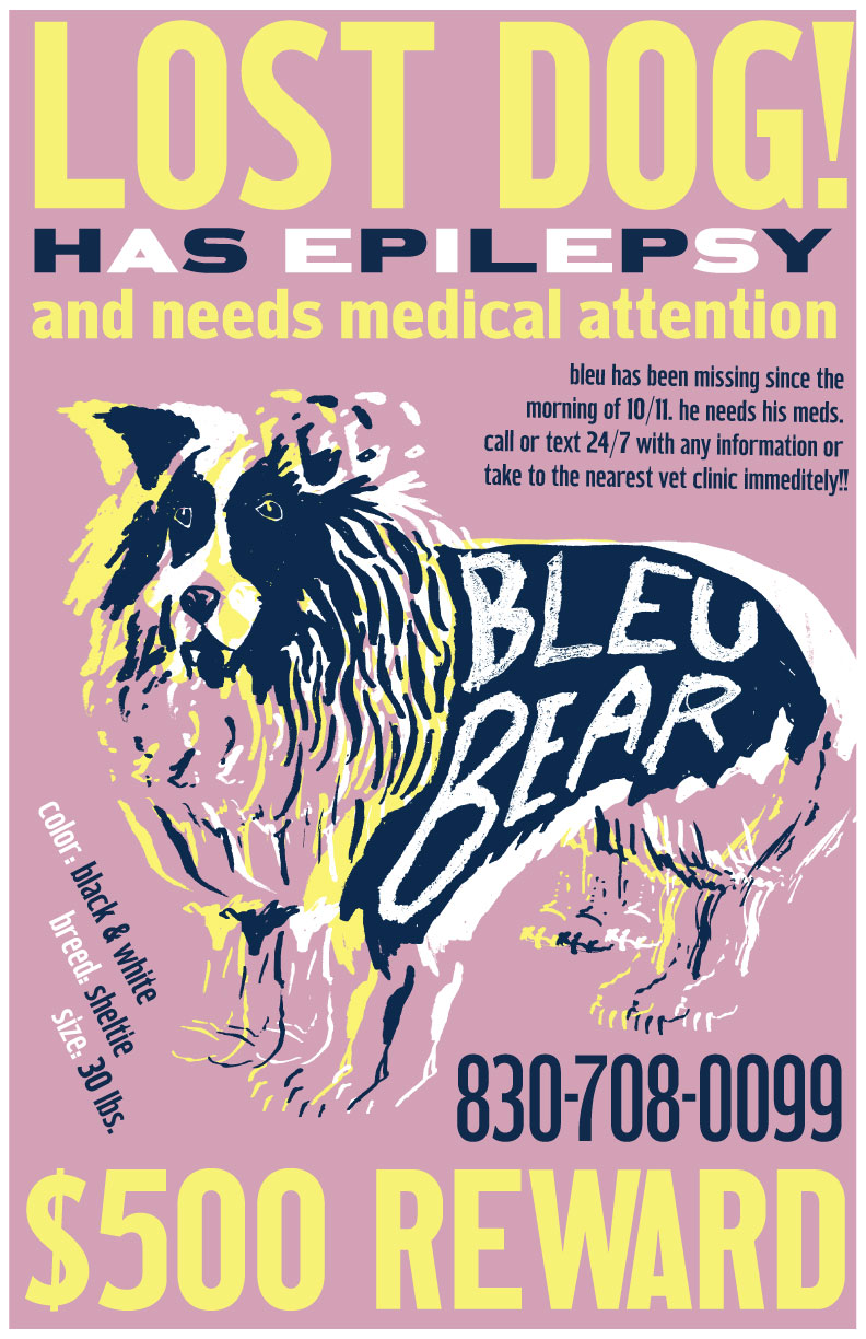
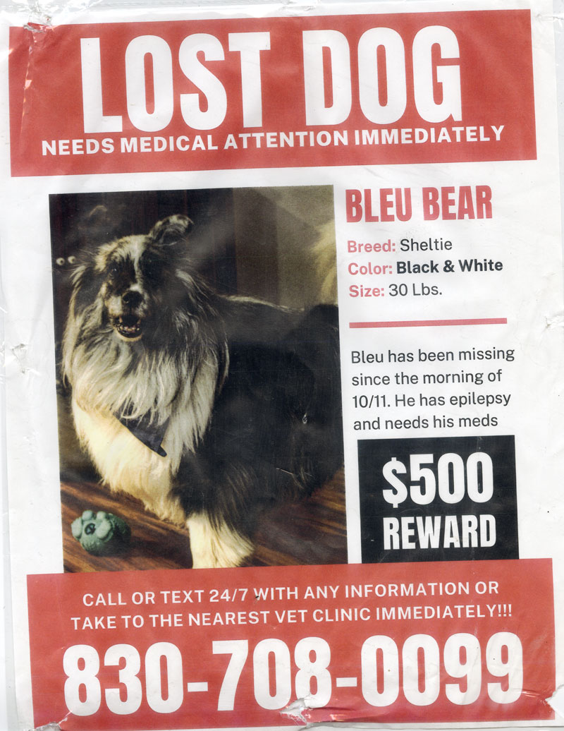
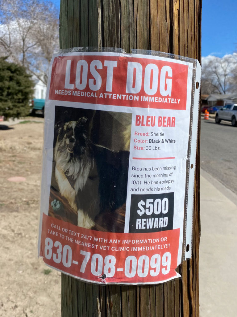
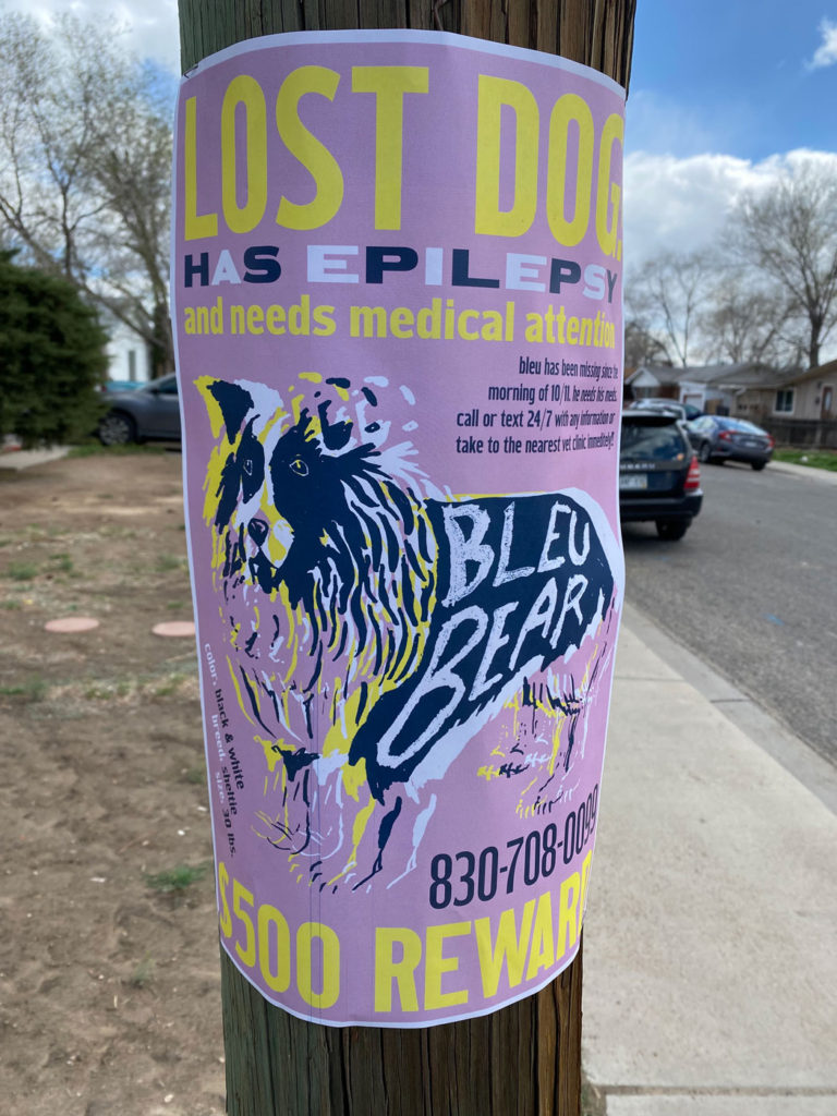
The Lost Dog project began with a scan of a real lost dog poster found on the streets. A full redesign was performed in which a palette, illustration style, and typefaces were chosen to create a more effective, communicative poster. Colors played an important role in the design of this poster because they contributed greatly to the visibility of the poster from afar. Contrasting dark and light values were used to achieve functional visibility. The typeface used is from Hamilton Wood Type collection, which specialized in wooden printing press type meant to be printed in large sizes.
the original and redesigned versions hung up outside.
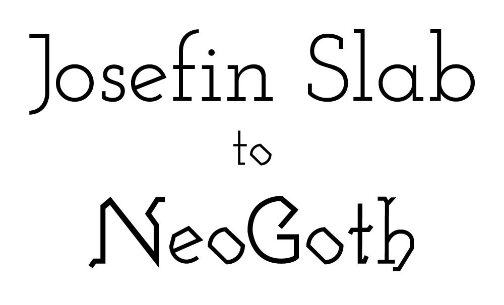
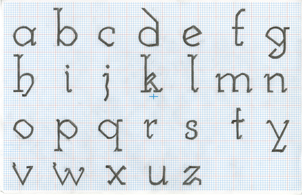
Modified Typeface
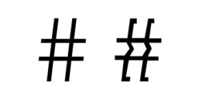
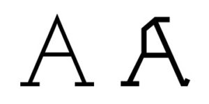
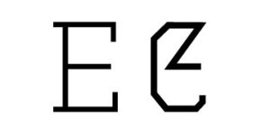
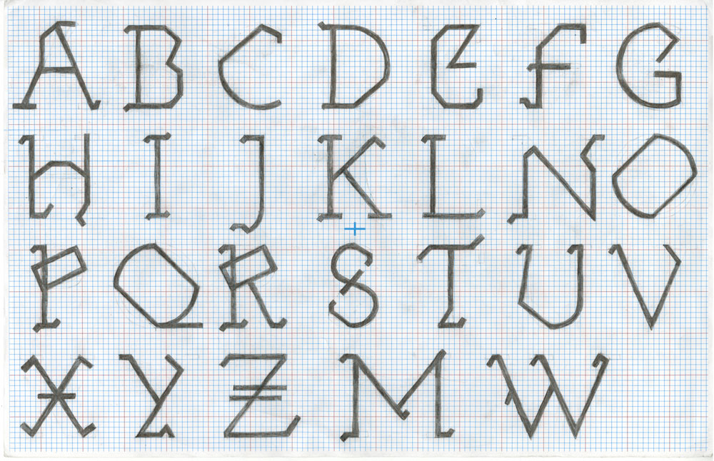
NeoGoth is a new typeface derived from Josefin Slab. To create the typeface, each character of the Josefin Slab Regular style was traced. Inspired from blackletter, a lettering style used in Europe starting in the 12th century, the traced characters were modified into new stylized forms. The new forms were then digitized, kerned, and then generated into a new typeface called Neogoth.
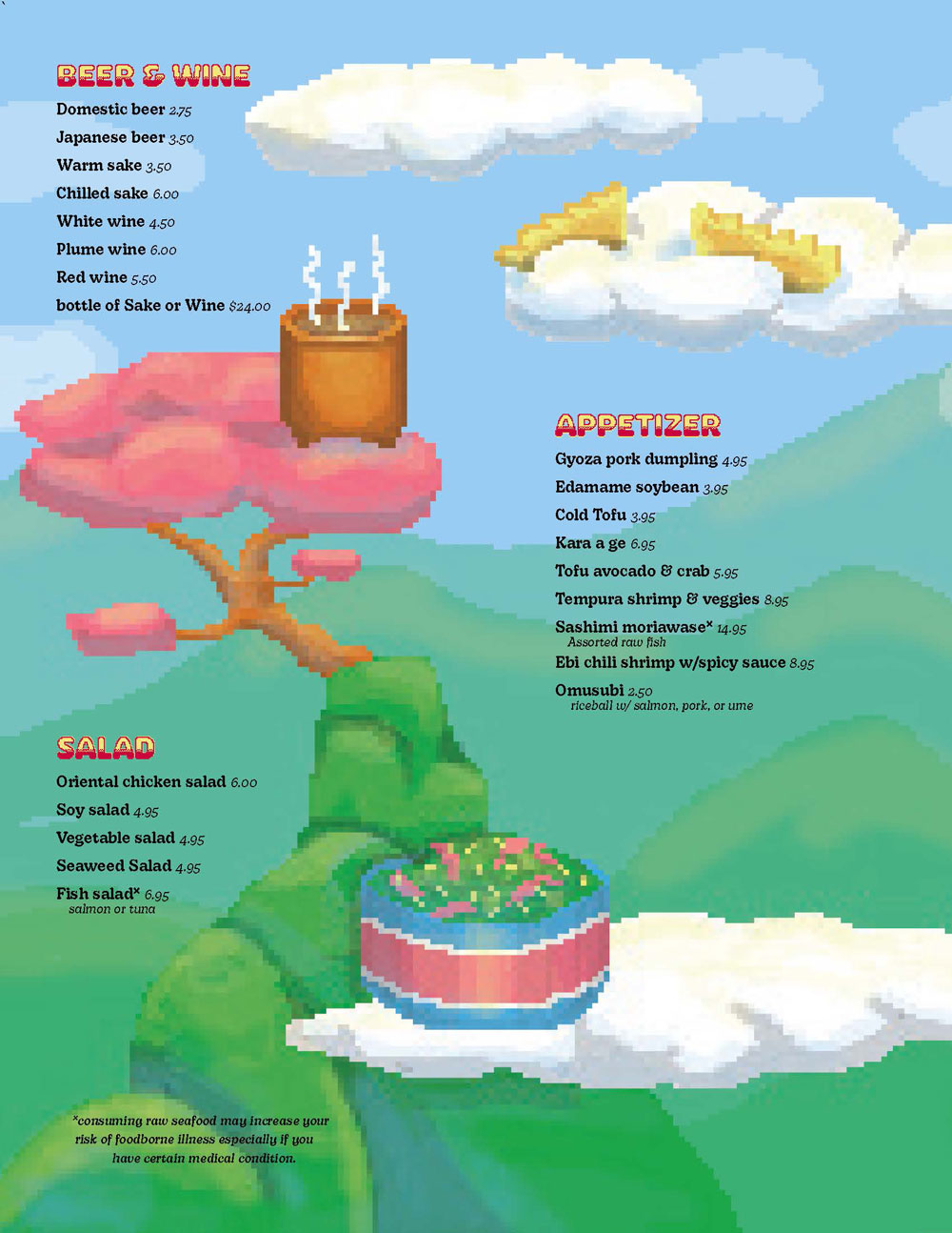
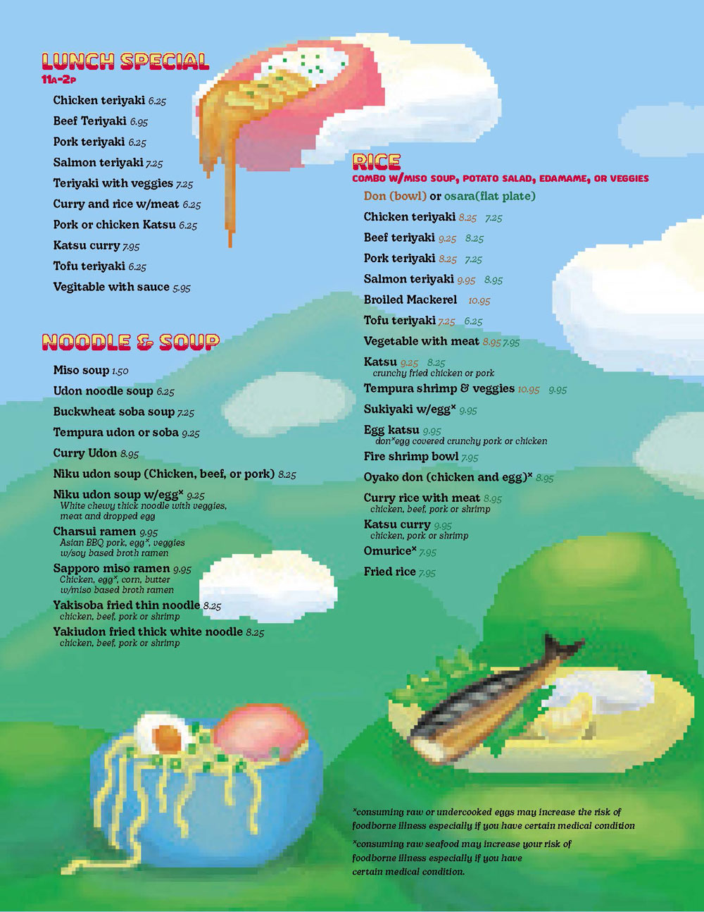
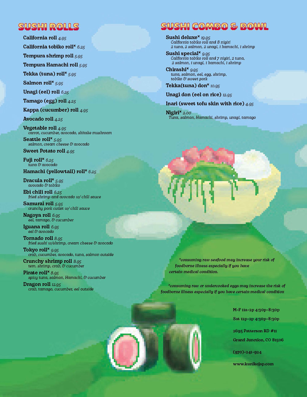
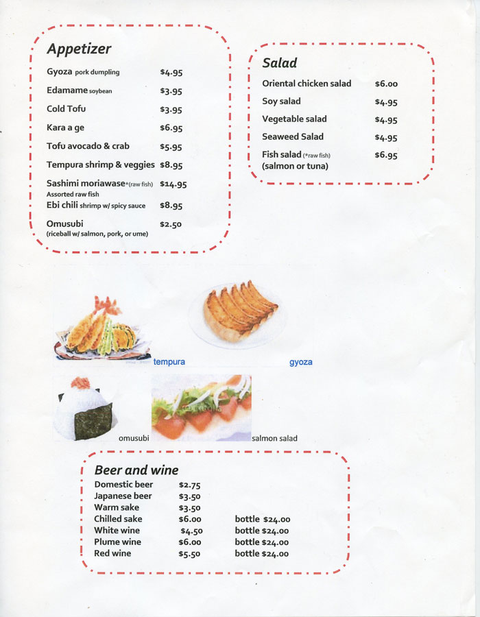
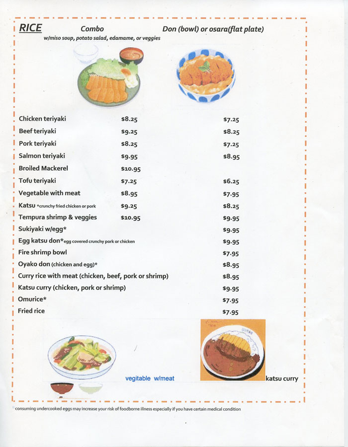
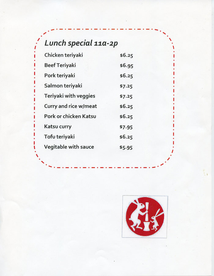
Menu Redesign
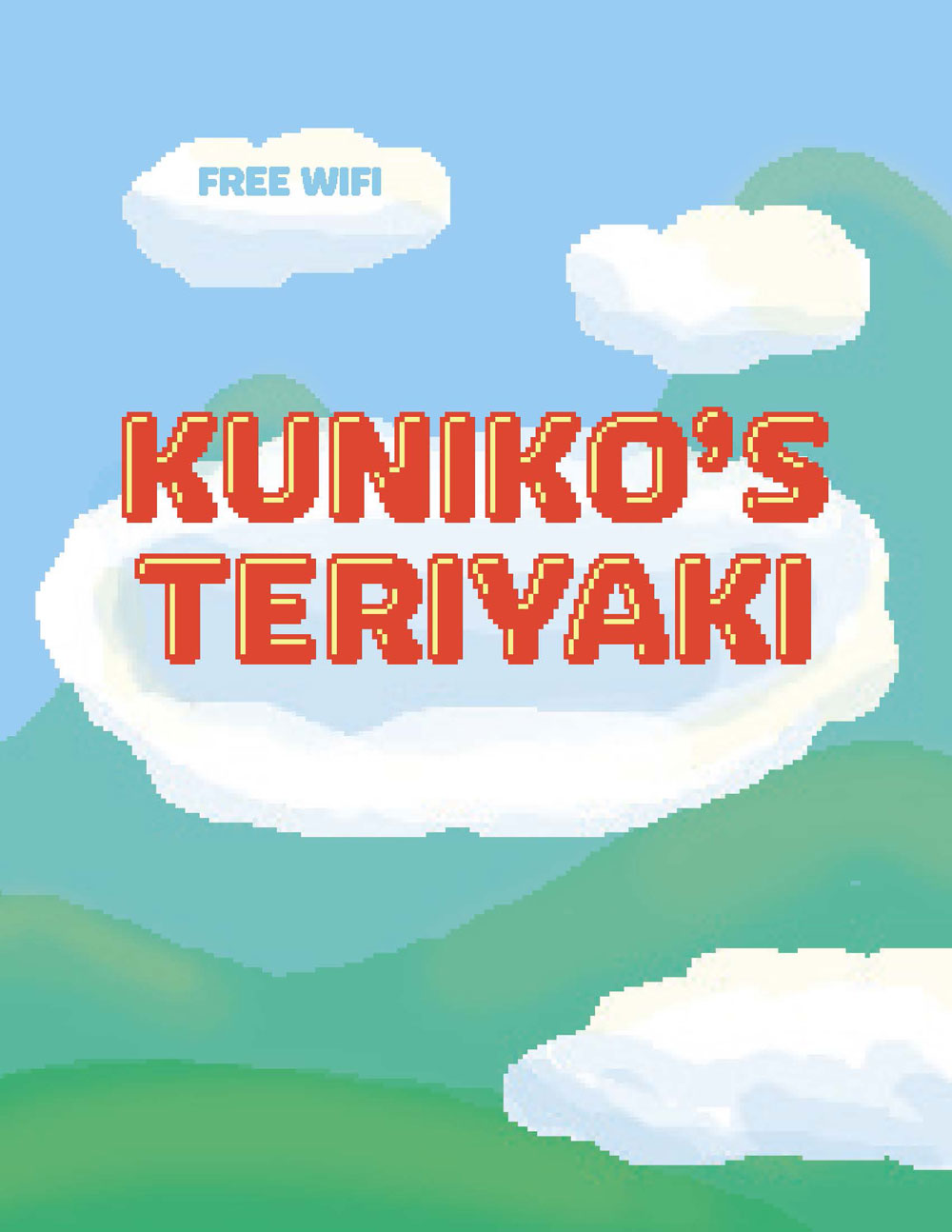
Kuniko’s Teriyaki is a local sushi and teriyaki restaurant in Grand Junction. To practice menu design including typography, illustration, and multiple-page layout, a mock redesign was done. It is imperative to menu design that the typography communicates well with the customers; function and efficiency is important, however an aesthetically pleasing design serves to an arguably equal value. The design shown above is inspired from low-resolution video games that were created in the 1980’s. With bright colors and playful illustrations, the menu has a welcoming spirit. The simplicity of the layout and the contrast of values between the background and the typography allows enough functionality to easily read the menu items.
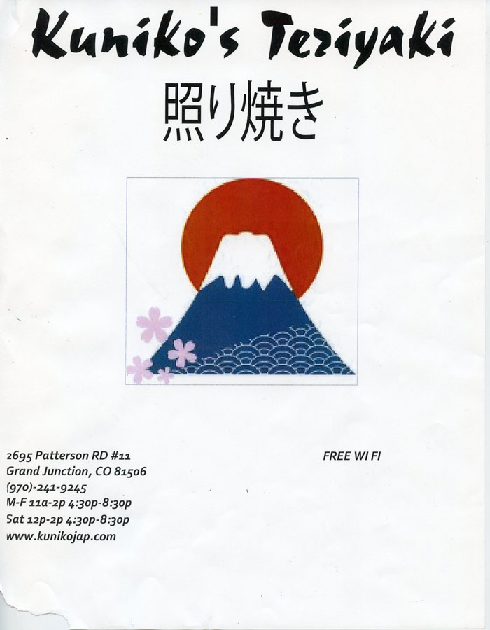
the original menu that the text was copied from.
Earth Day Card
The Earth Day Card project encompassed a wide usage of digital and traditional media. The imagery was developed via digital collage in Photoshop; it features open source images taken from the library of congress’ online site. The lettering was done using a traditional sign painting method called casual lettering that was later scanned and edited in photoshop. When the design was completed, it was sent to a business that creates plastic reliefs from the digital design. The relief was then printed on a
Chandler & Preston printing press.
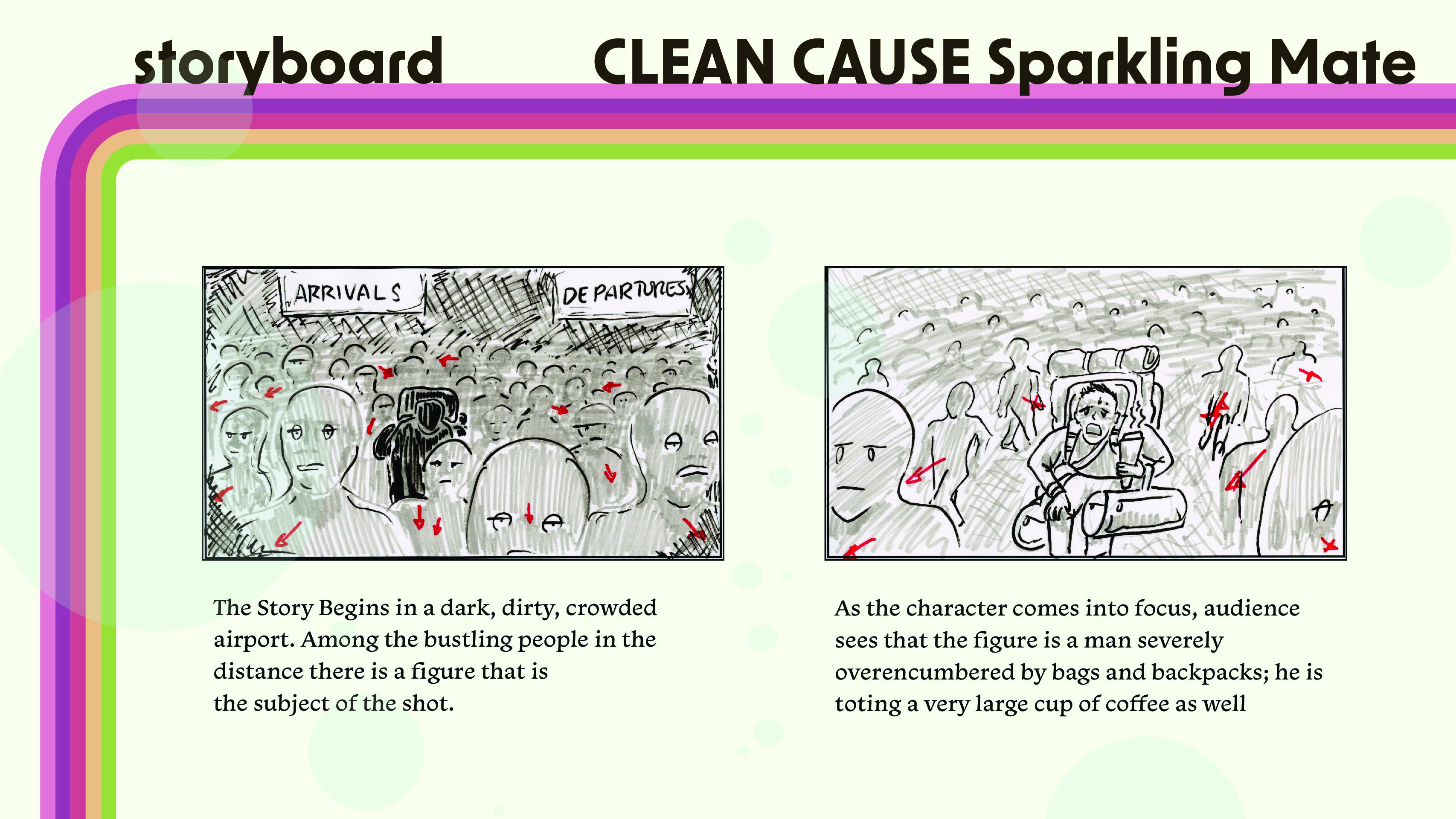
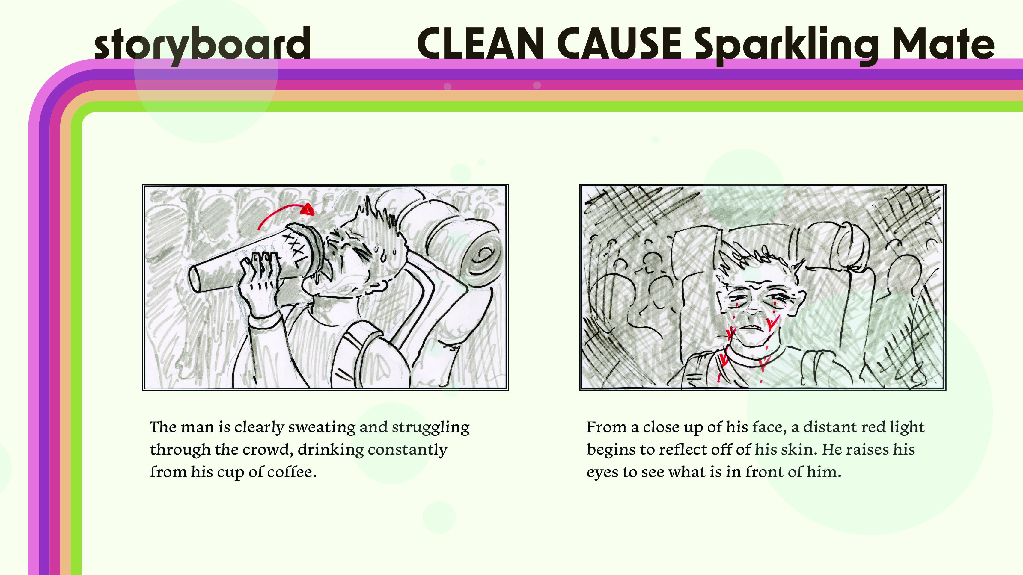
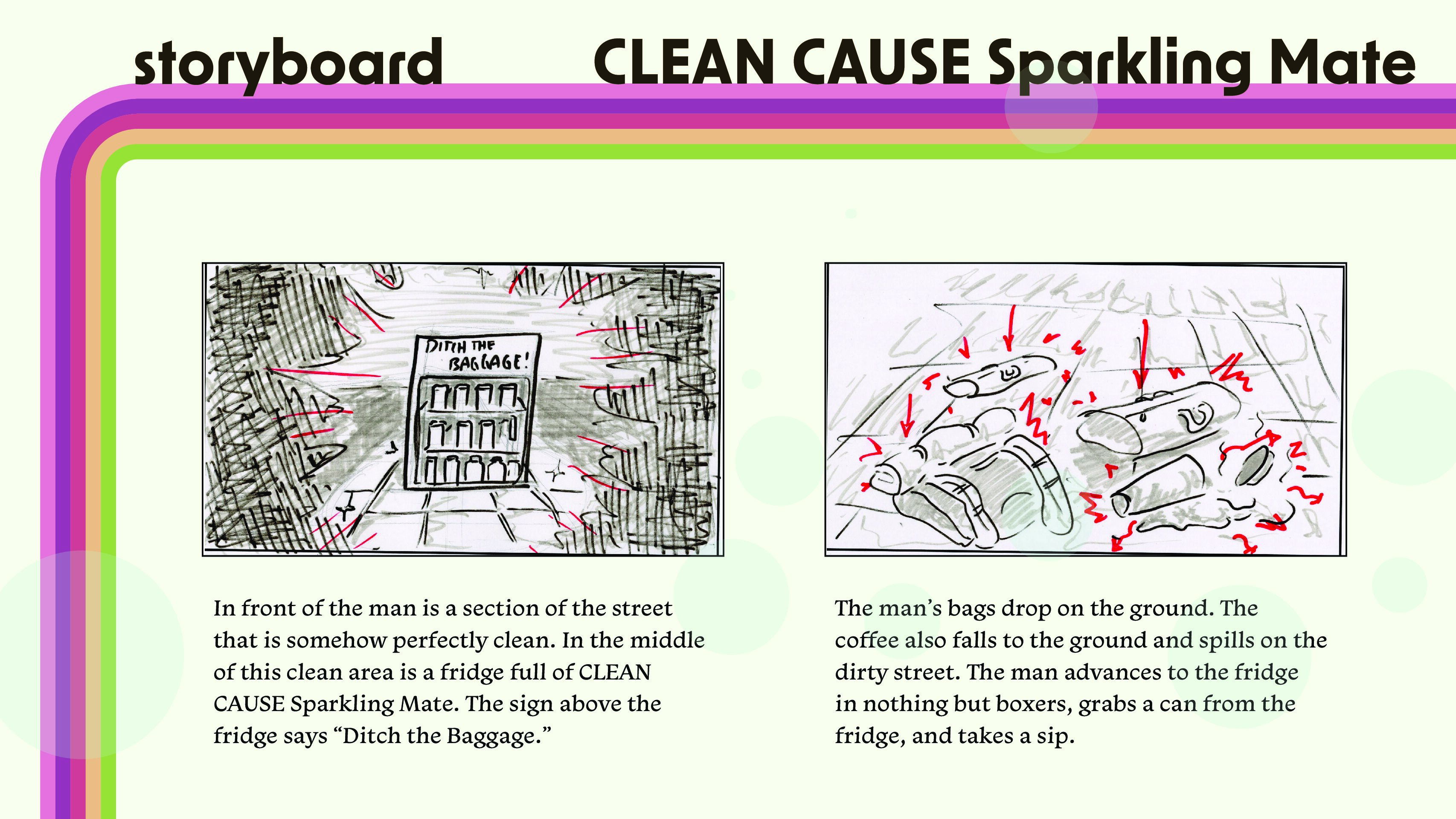
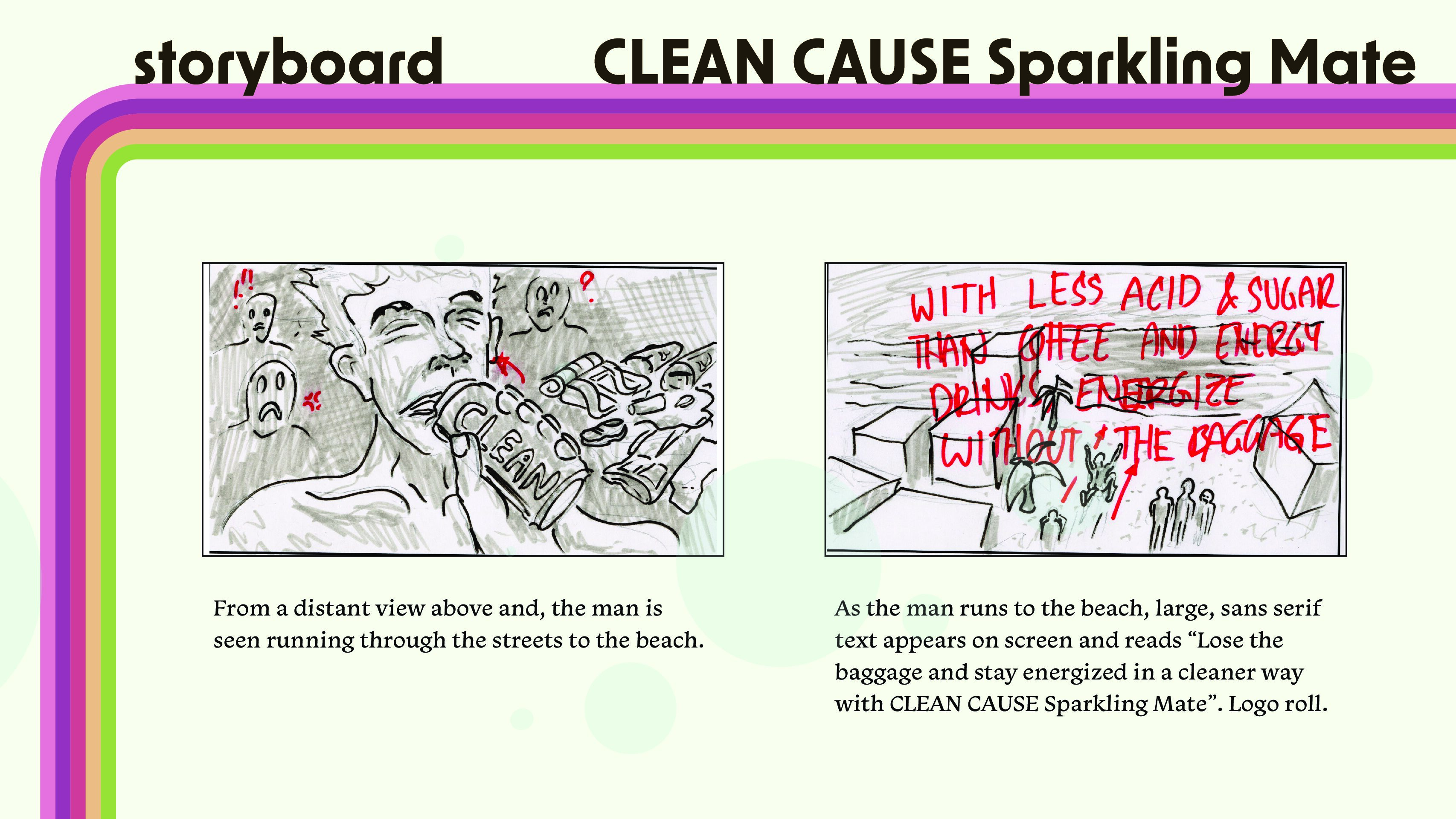
Storyboard for Motion Advertisement
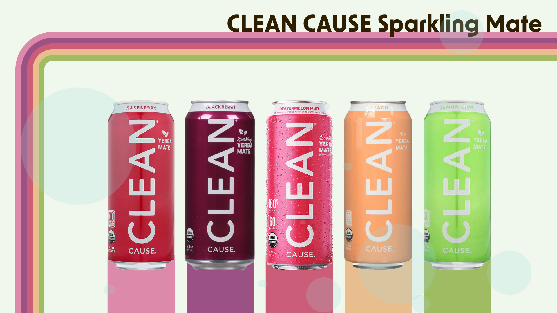
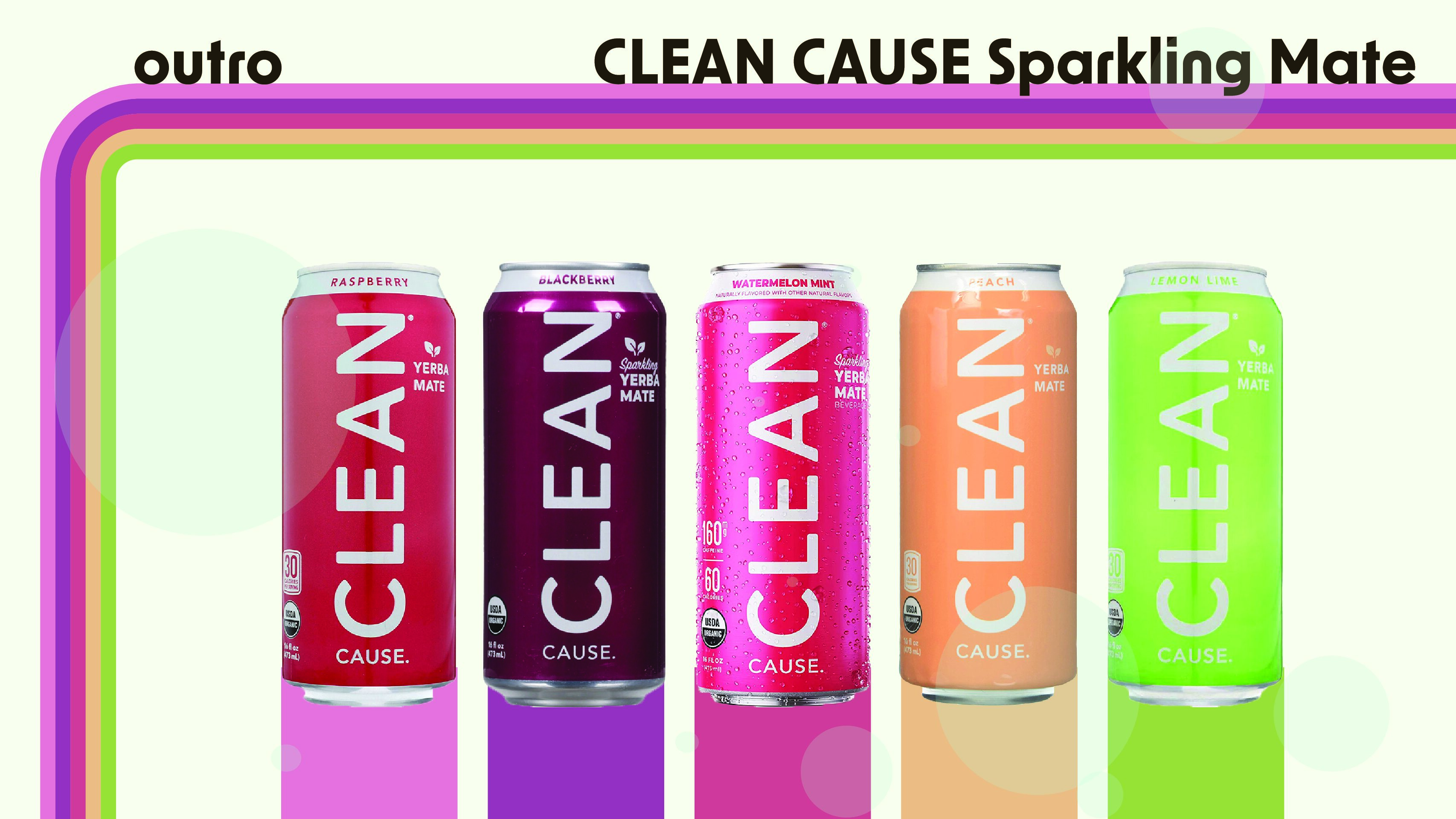
Clean Cause Yerba Mate is a brand of cold, canned Yerba Mate that is intended to be a healthier replacement to energy drinks. The task that inspired this post was a conceptual exploration using a mind map to find a slogan that would represent the company well. The ultimate result of this search was “Ditch the baggage,” in reference to the added sweeteners and preservatives found in most other energy drinks. With this slogan as a prompt, A slide deck of hand drawn storyboards was developed to show concept for a potential advertisement that would appeal to the target audience. The whole slide deck is available to view in the link below.