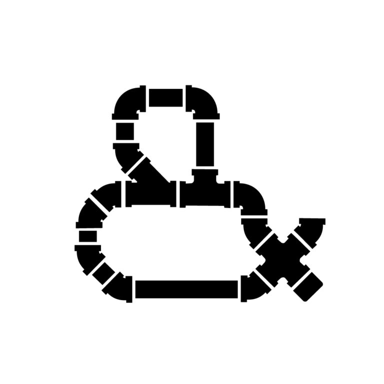
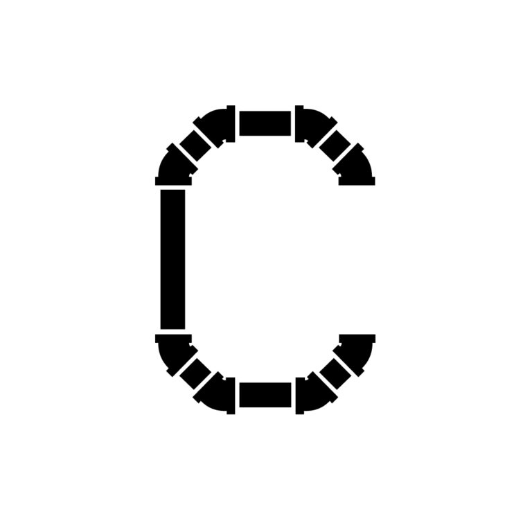
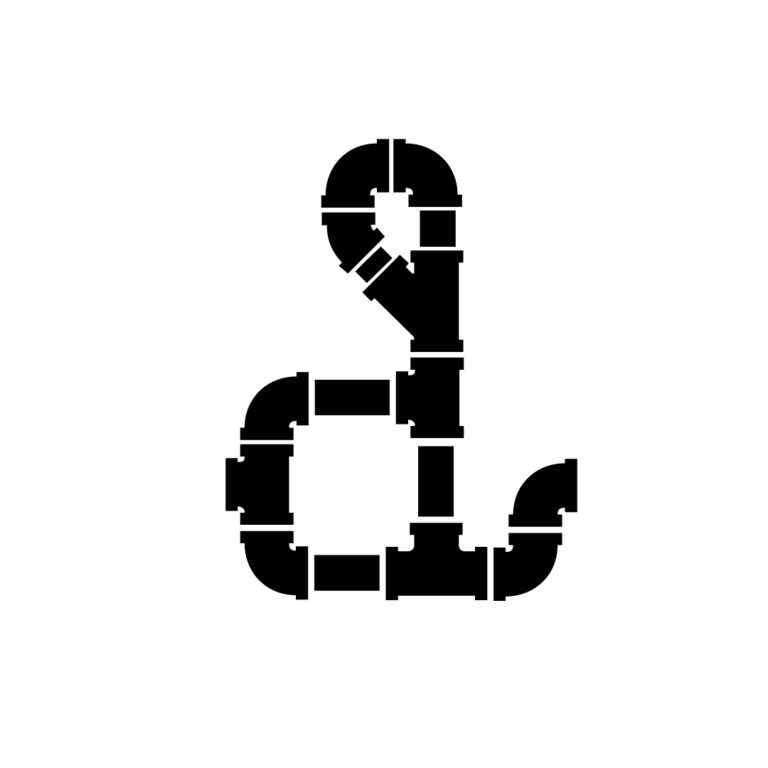
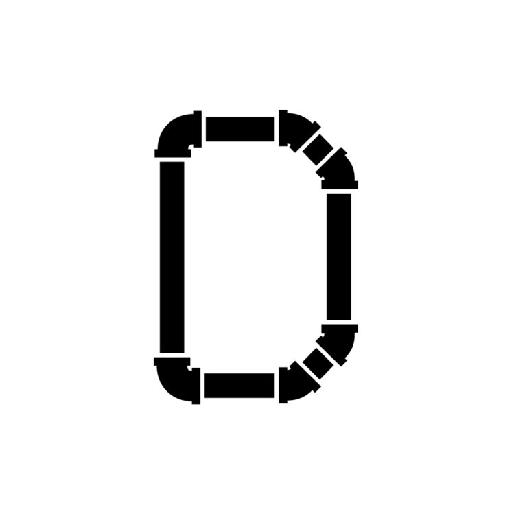
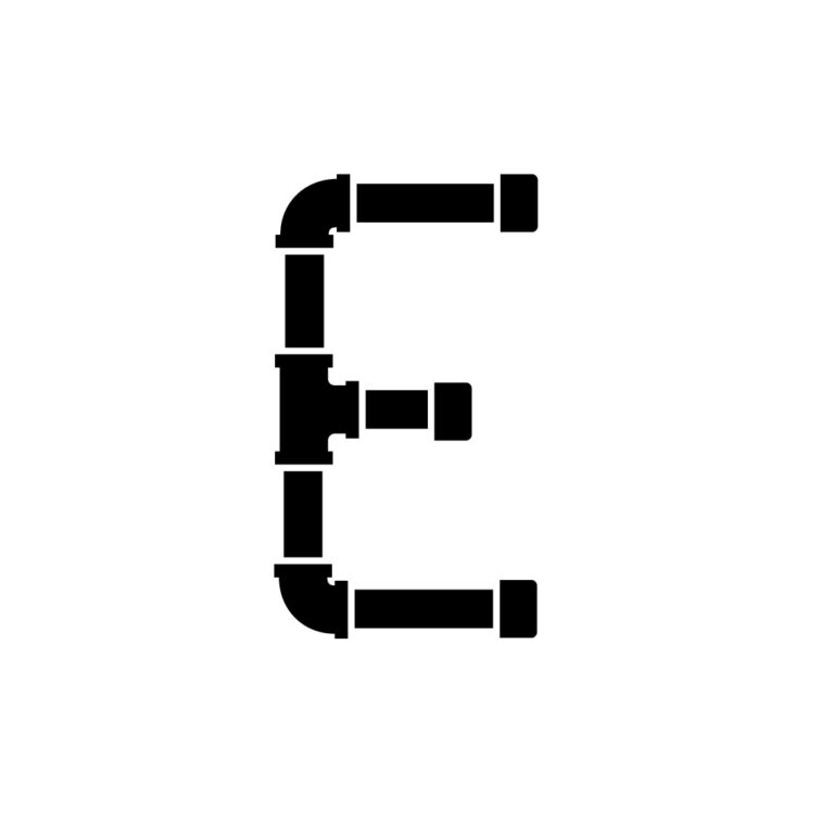
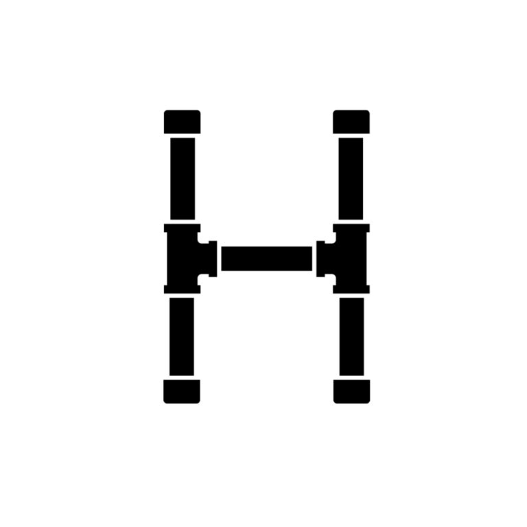
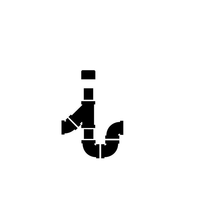
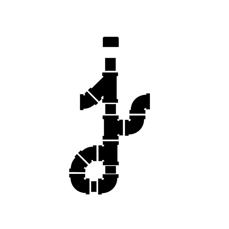
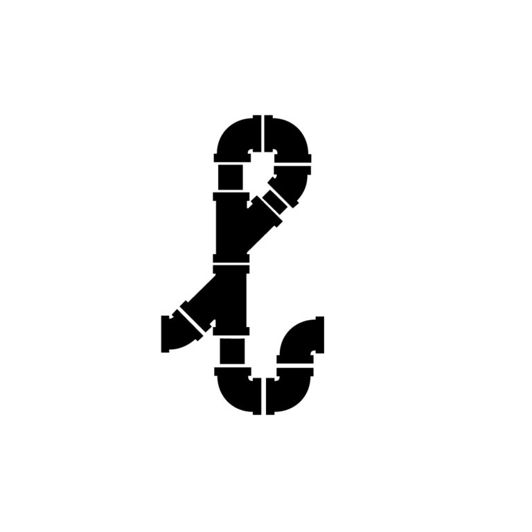
Display fonts are used primarily in titles, signage, or other applications where larger, more illustrative type is necessary. One of the most important things about developing a typeface is ensuring that all of the characters maintain uniting characteristics in their geometry.
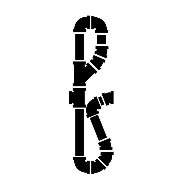
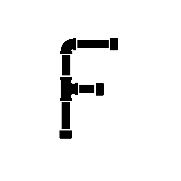
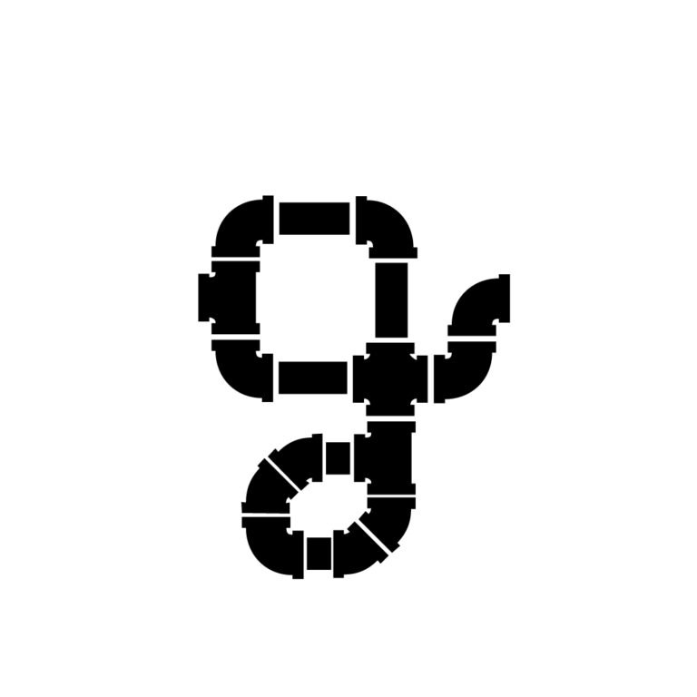
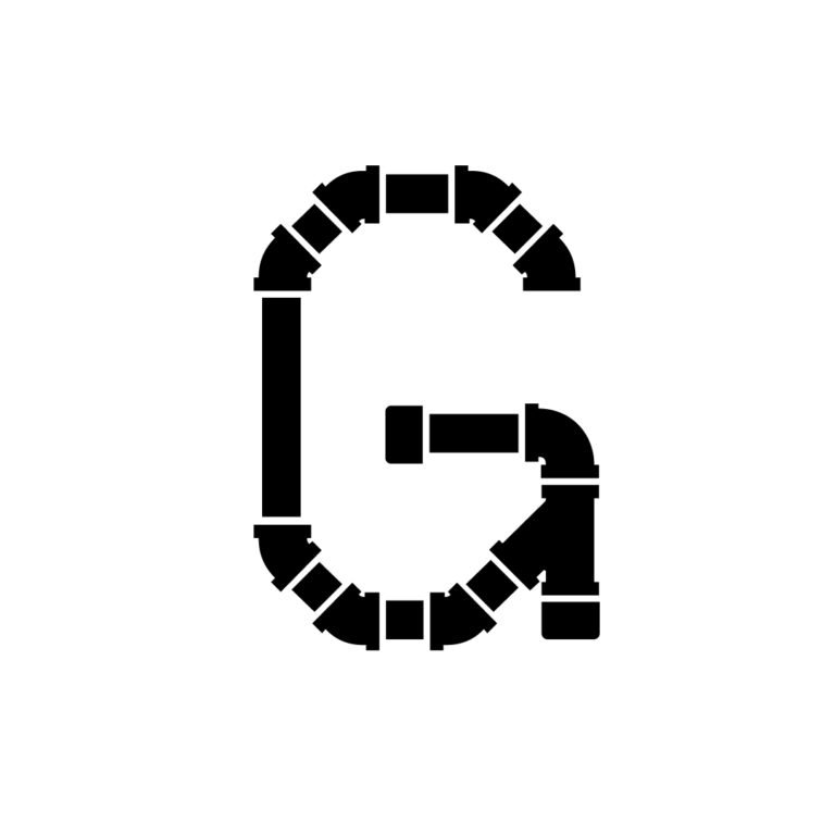
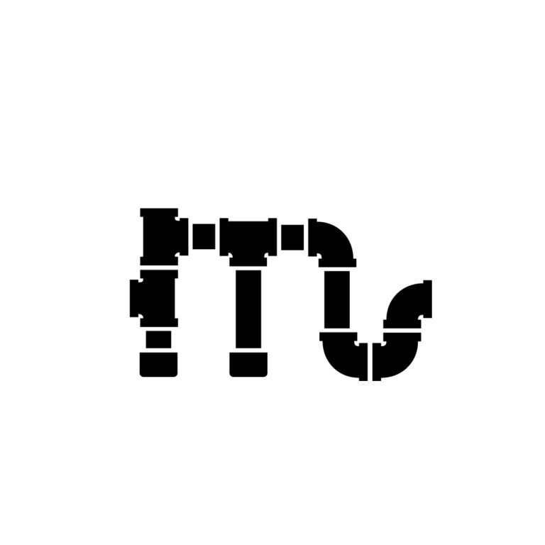
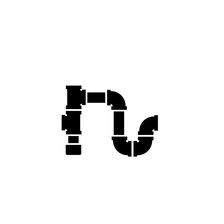
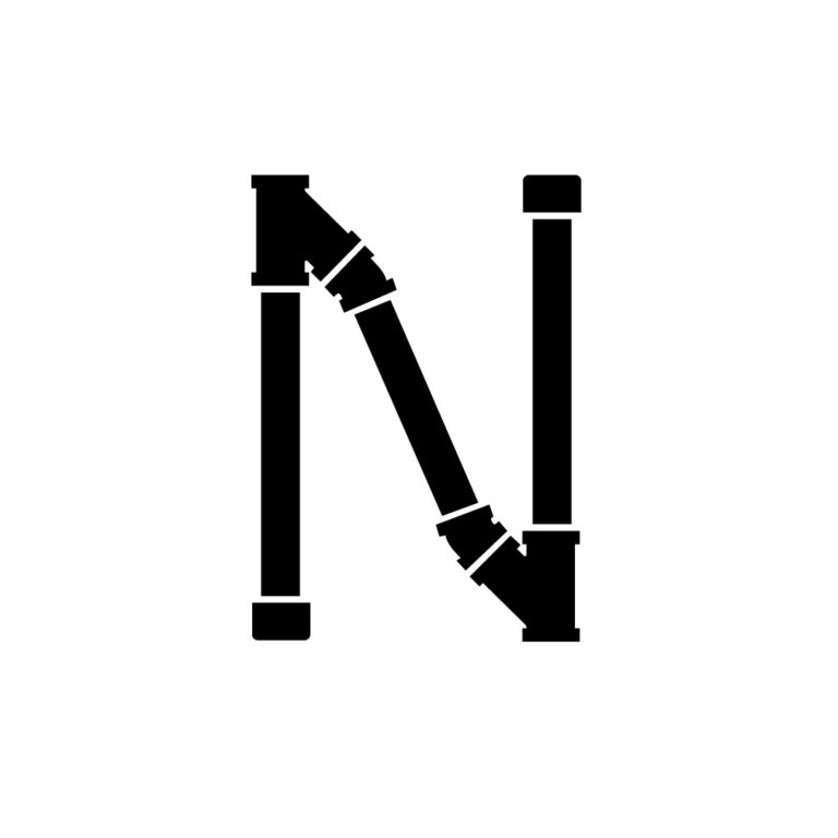
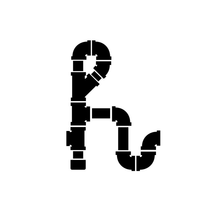
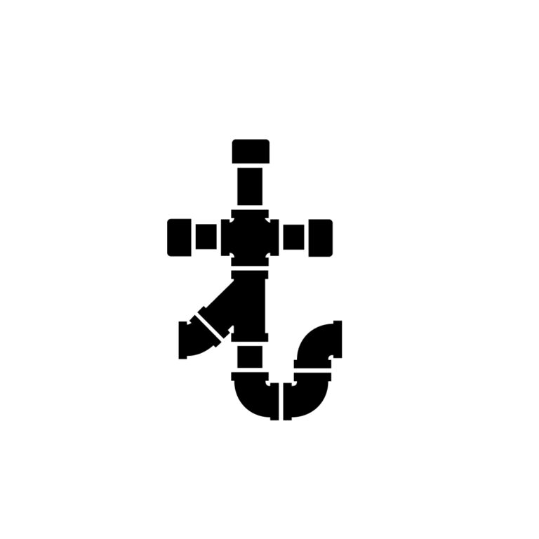
A letterpress class inspired this typeface a year before it was made. While looking through the large collection of metal-type fonts, I was impressed by the script typefaces that were made to look handwritten even as interchangeable metal pieces. Even script and cursive typefaces have rules and consistency. Pipeface is an exploration of stroke vocabulary and consistency as it attempts to bridge a rigid, industrial style with a humanist hand using the uniting factor of a system.
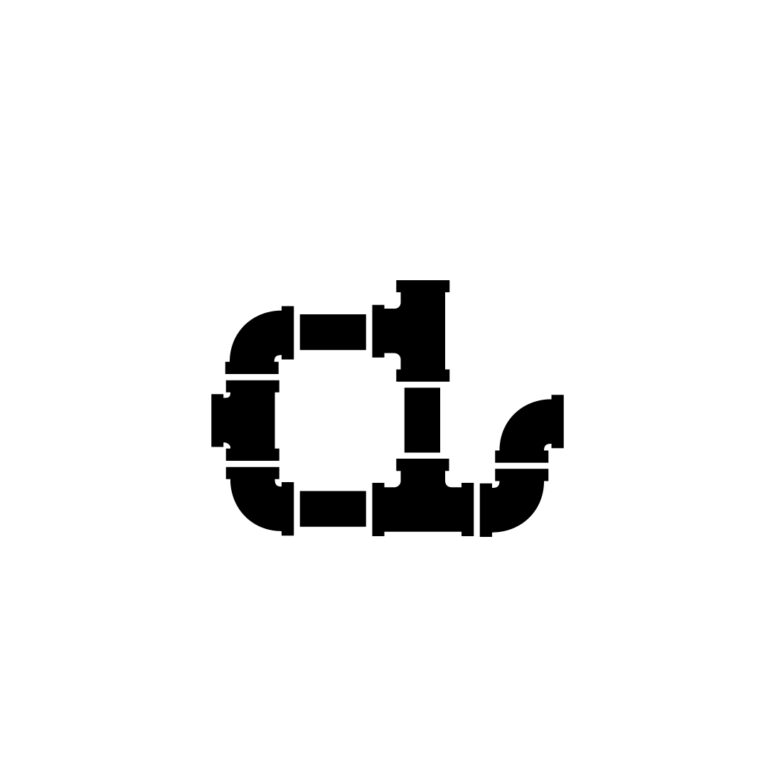
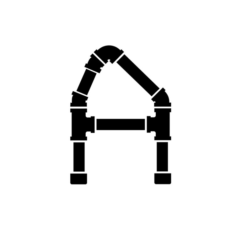
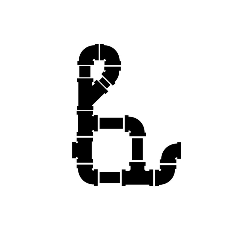
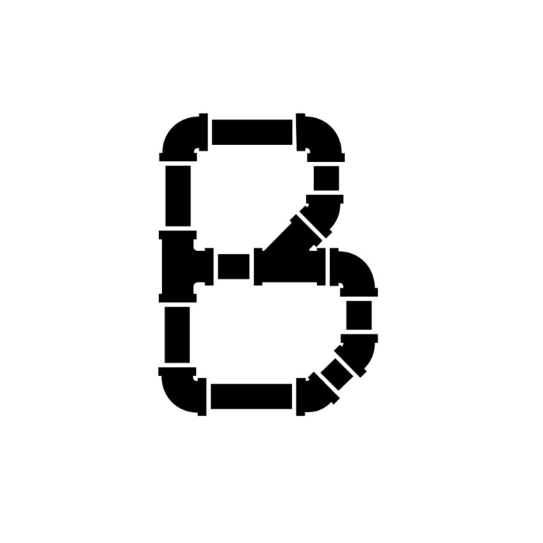
The characters in Pipeface are comprised of common pipe fittings that fit together to make each word a fluid sequence. Once the set of fittings was developed, they would be used repeatedly to form each character. This method established useful constraints that helped maintain consistency between letterforms.