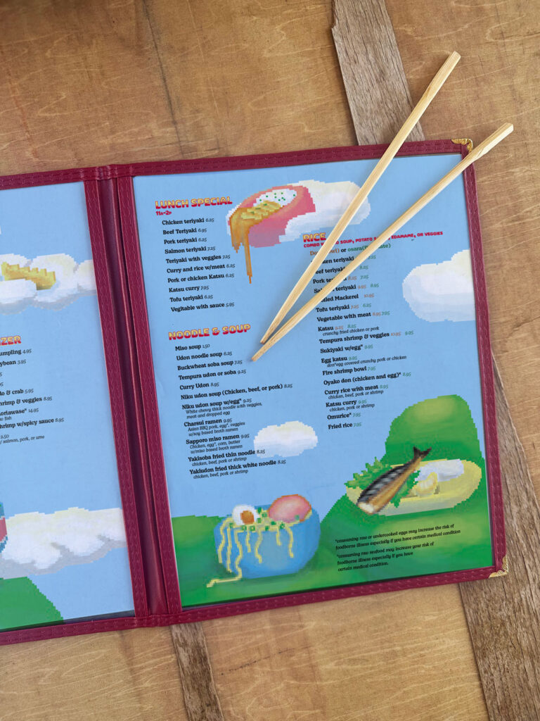
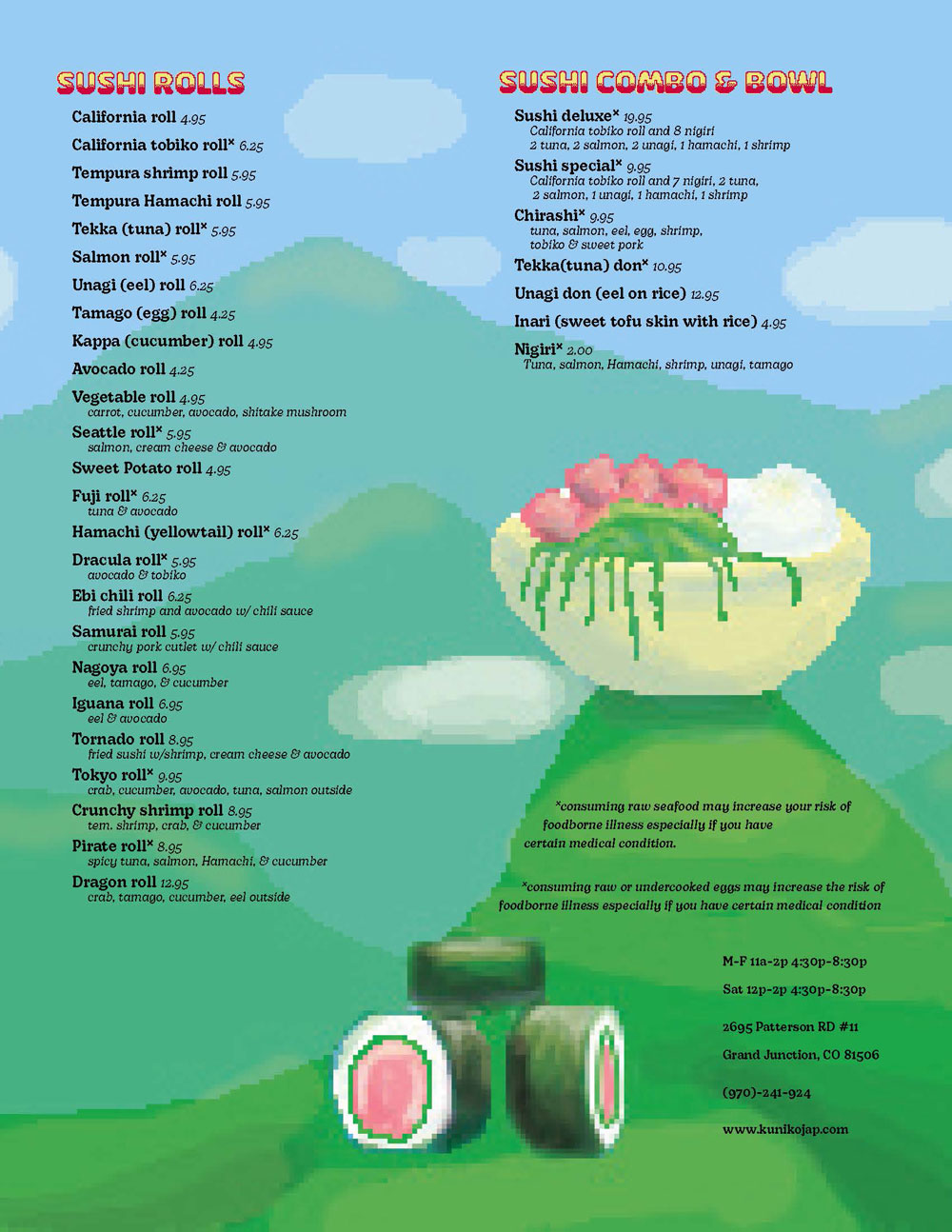
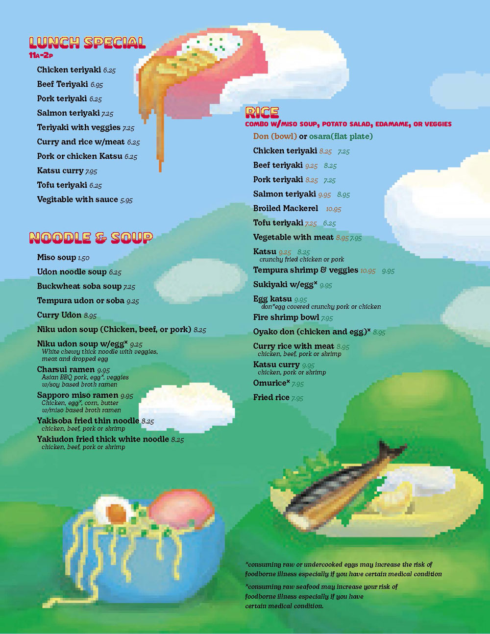
Developing hierarchy and organization for a food menu
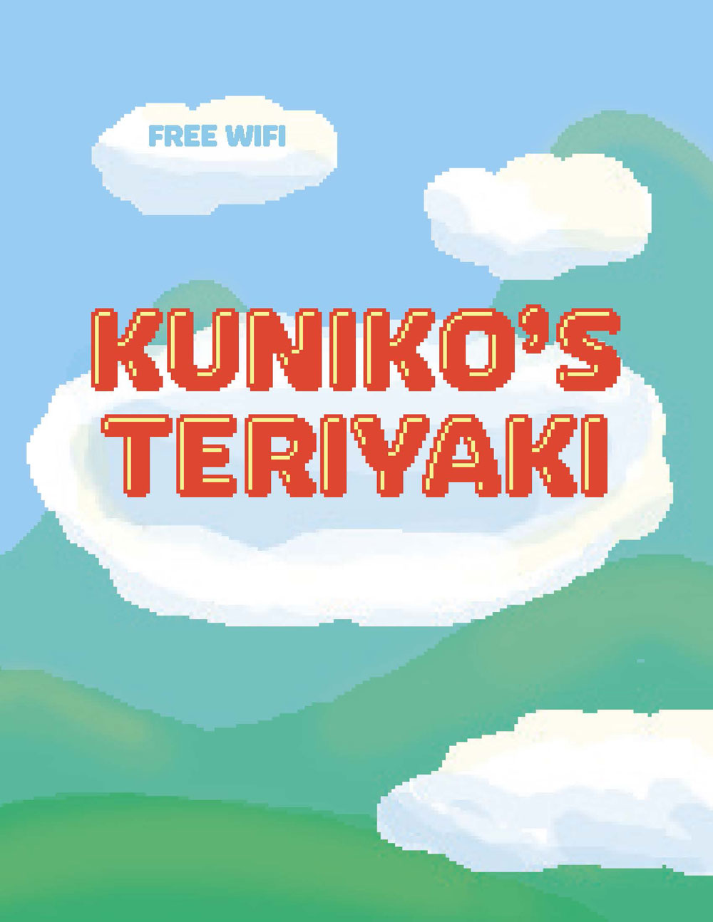
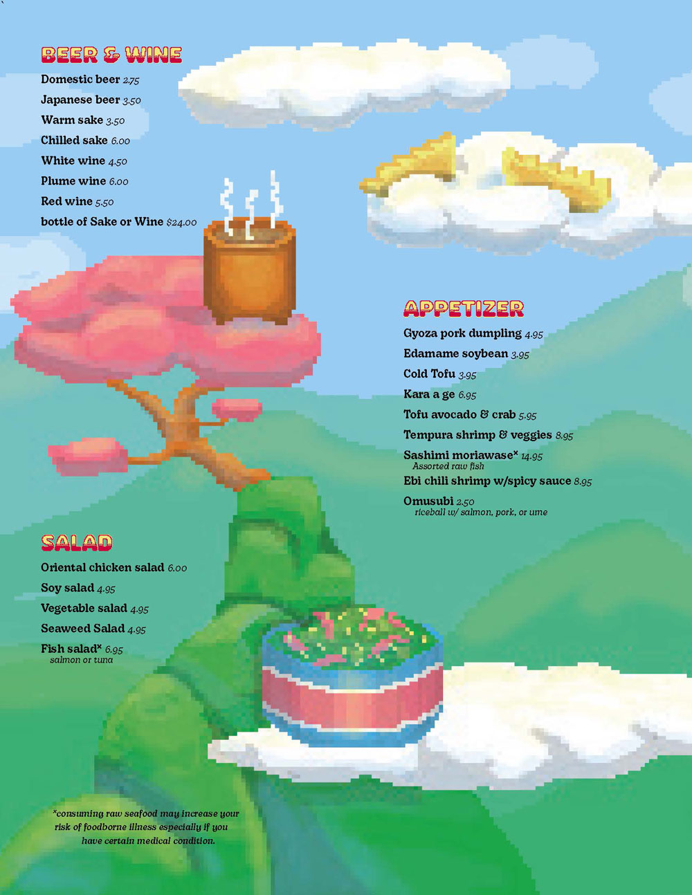
Kuniko’s Teriyaki is a local sushi and teriyaki restaurant in Grand Junction. To practice menu design including typography, illustration, and multiple-page layout, a mock redesign was done. It is imperative to menu design that the typography communicates well with the customers; function and efficiency is important, however an aesthetically pleasing design serves to an arguably equal value.
An essential element for the organization and readibility of the project was the establishment of hierarchy throughout the menu. All elements in a menu must be divided so their purpose is understood with no need for context. This hierarchy needed to be established in the section titles,subheadings, items, prices, and item descriptions. To achieve this, various fonts of two different type families were used for differentiation while maintaining a cosntant visual style.
The design is inspired from low-resolution video games that were created in the 1980’s. With bright colors and playful illustrations, the style appeals as much to younger customers as it does to nostaligic, older customers. The simplicity of the layout and the contrast of values between the background and the typography allows enough functionality to easily read the menu items without making the whole spread dull..