Homestead Natural Meats is a ranch collective and meat processing cooperative that provides goods and processing services to customers on the Western Slope of Colorado. The company was originally branded in 1996 and maintains the same branding today. As an exercise in branding, a comprehensive mock rebrand was undertaken. This entailed logo design, palette selection, typography selection, and brand guidelines to build a complete identity.
Important aspects to consider in brand development were the need to maintain reputation while actualizing for a newer time. Homestead is a family business that relies on its reputation in a network of very small communities, these communities often rely heavily on the brands that they are familiar and have history with. A risk of rebranding is losing touch and familiarity with faithful customers. As these communities inevitably grow, they also welcome residents that are not yet familiar with the brand and will be more receptive to modern design practices.
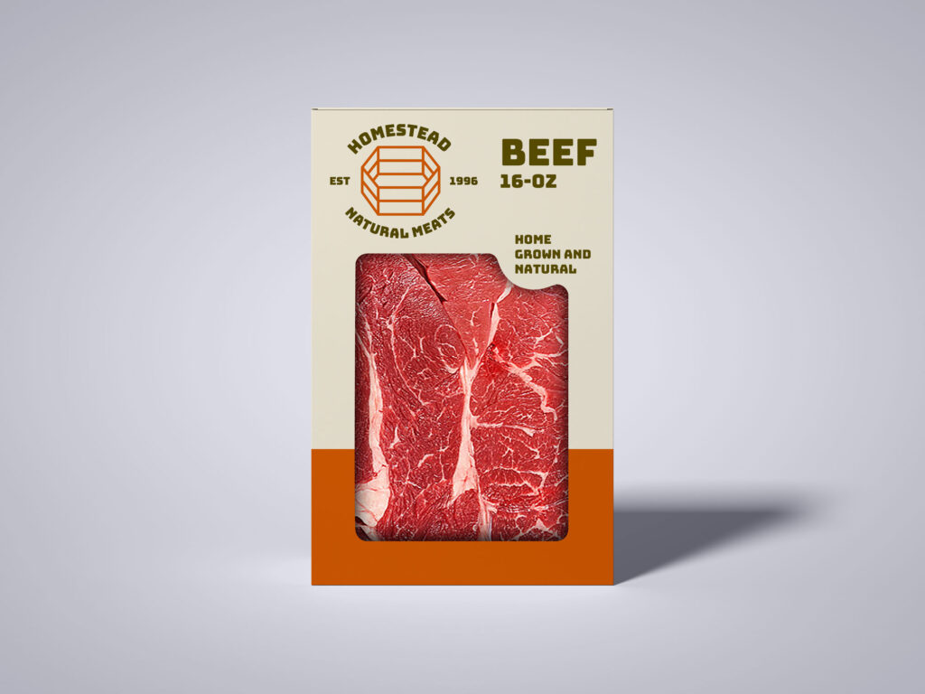
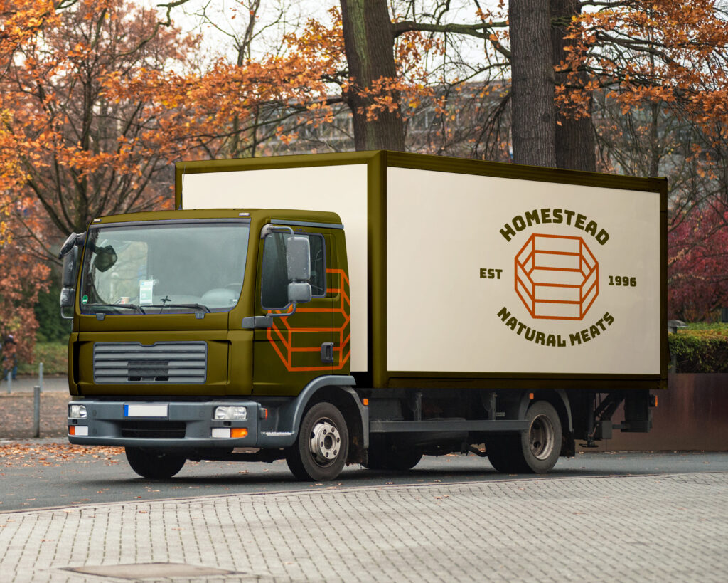
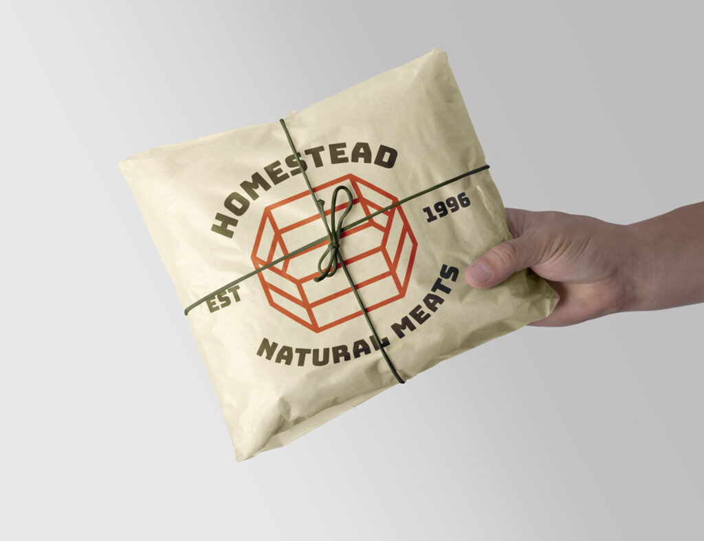
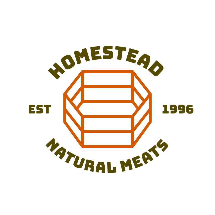
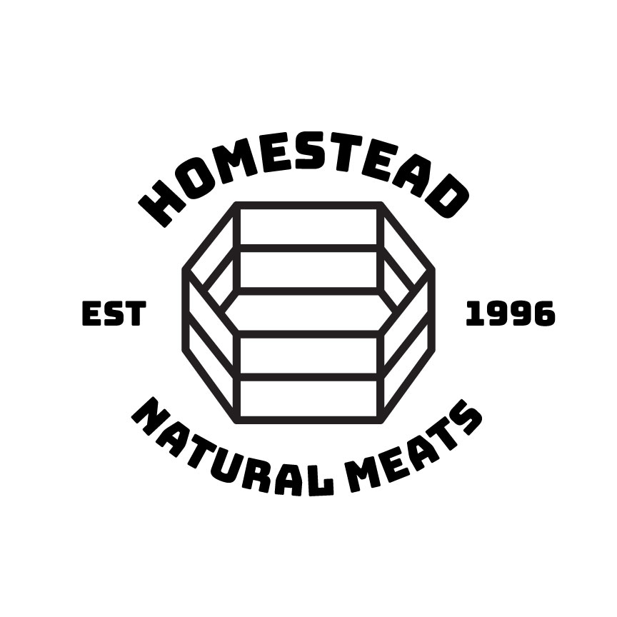
To preserve the principles and reputation that the brand is built on while also widening its customer base, an earthy and industrial look informed the branding process. The logo is rigid and geometric yet easily reads as the familiar symbol of a corral which alludes not only to the industry it serves but also to the protective and homelike characteristics of a corral or fence.
The palette selection was inspired by rust and hay. The bright orange inspired by rust is not only highly visible, but also assists the idea that Homestead Natural Meats is a company with history and character. Warm dark green was used as a strong contrast to the bright orange and also as a softened replacement for black.